WORK
Web (UX & UI)
Year
2025
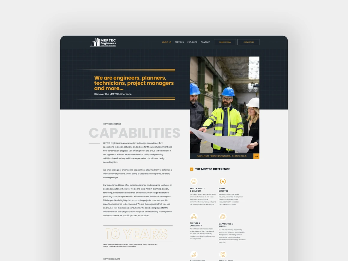
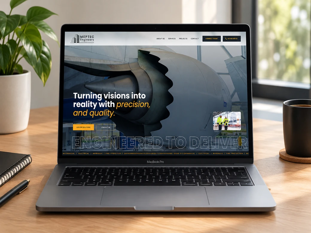
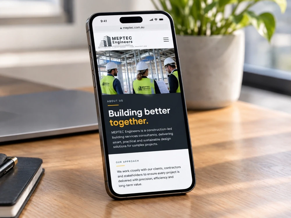
MEPTEC Engineers is a construction-led building services consultancy with offices in Brisbane and Sydney, delivering mechanical, electrical, hydraulic and fire design, plus BIM and point cloud services, to projects across Australia.
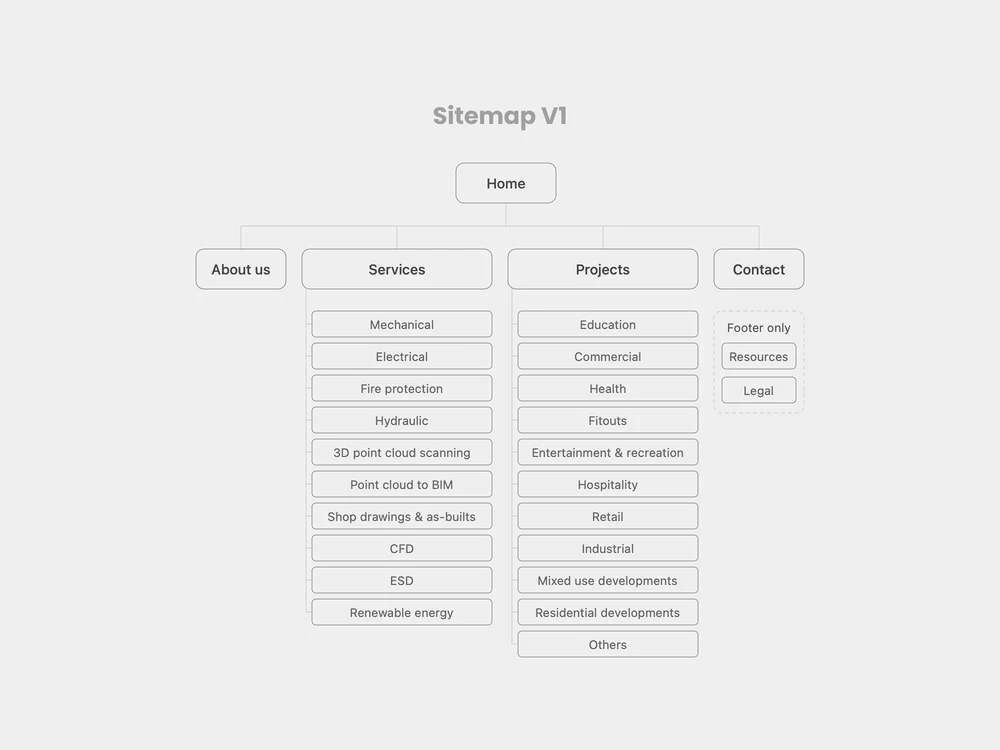
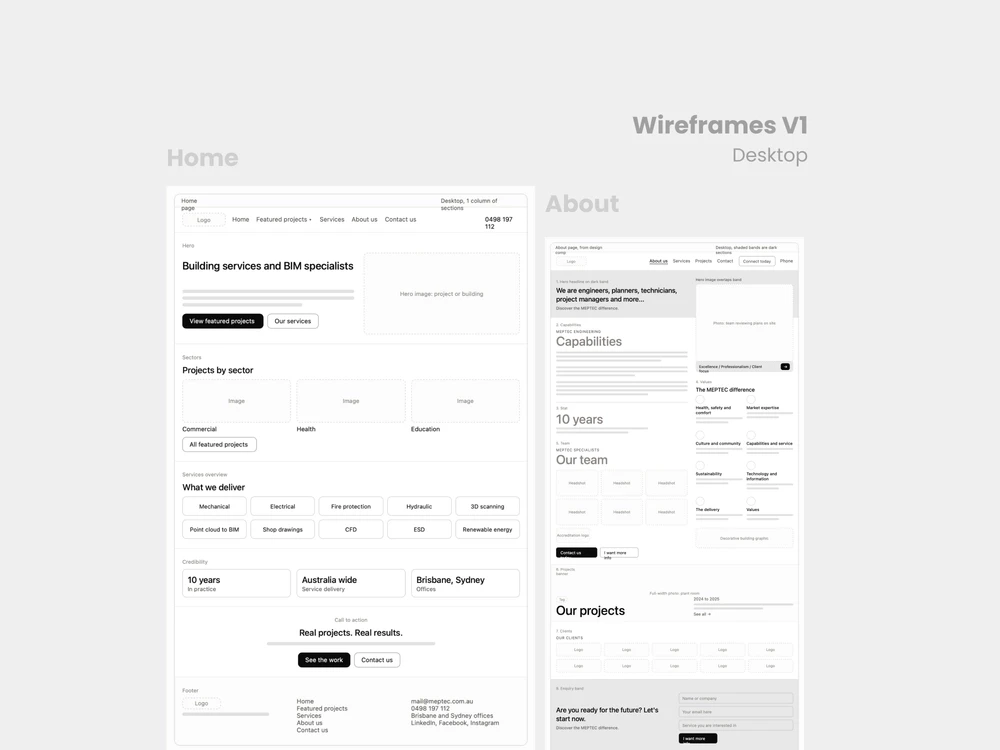
As a UX and UX designer on this project, I focused on the structure of their website. I mapped the full site architecture and designed low-fidelity wireframes for every page, on both desktop and mobile. The goal was to make a technical, service-heavy business easier to understand at a glance, so a visitor can quickly see what MEPTEC does, who's behind it and how to get in touch.


Setup
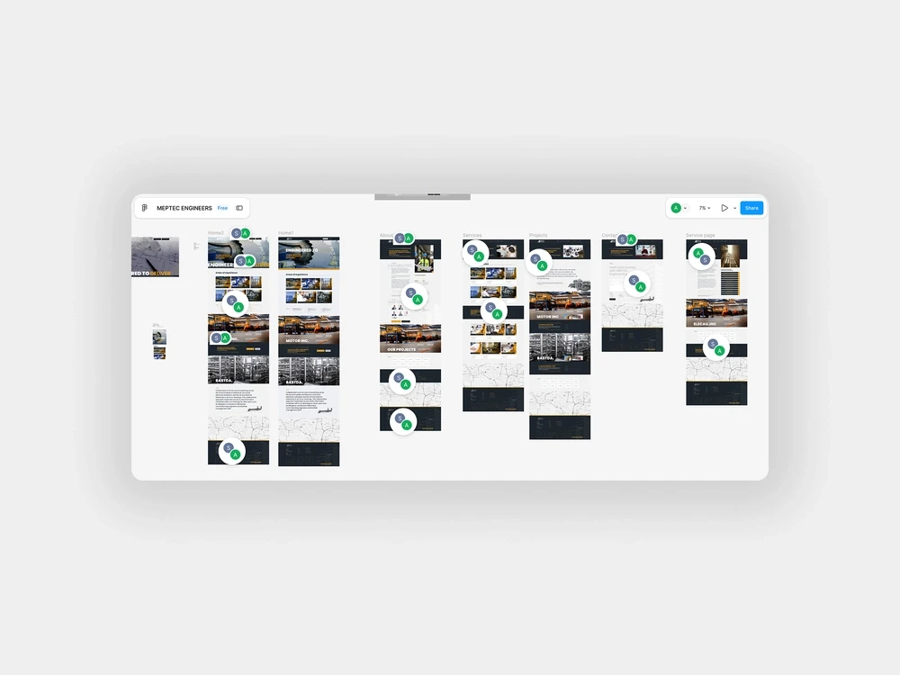
The brief was simple: show MEPTEC's values and capabilities clearly, and get visitors to reach out. I started by mapping the existing site page by page, which gave me four main pages, ten services, eleven sectors and a few footer-only pages. Seeing it all in one place exposed the gaps, like a footer that only features four of the services, and gave me a clear list of problems to solve before wireframing.
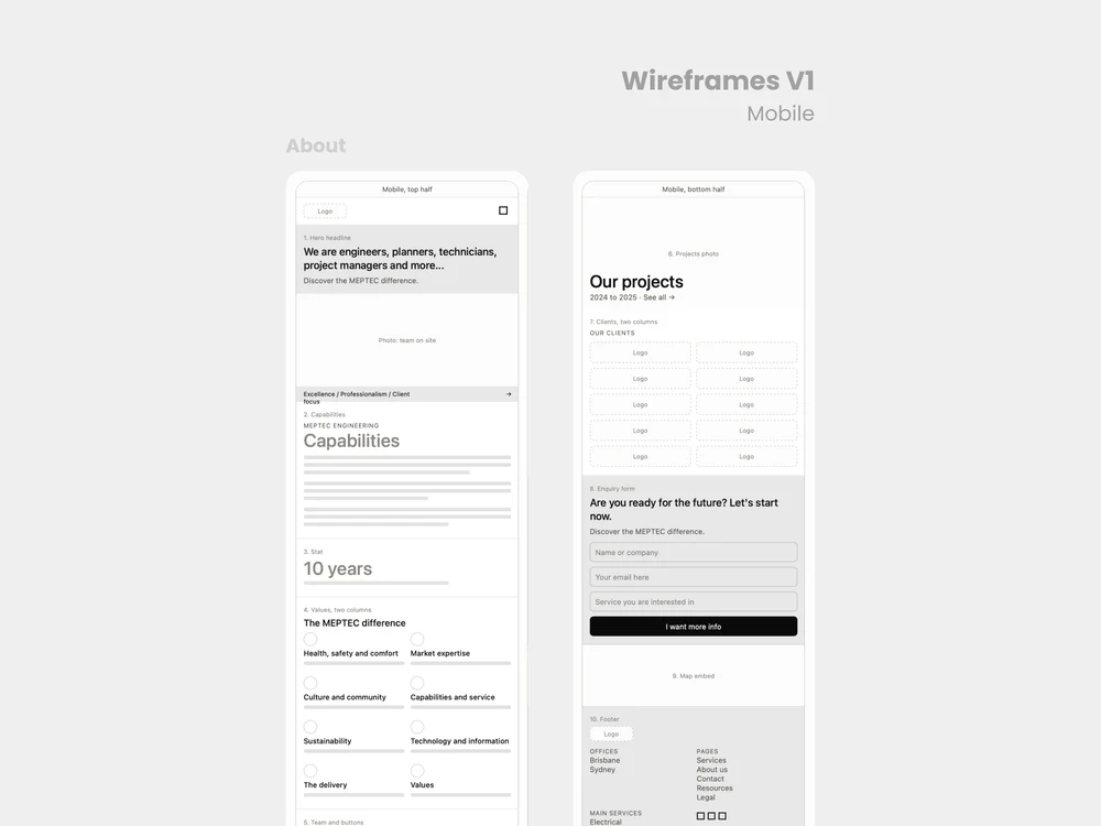
I kept things deliberately rough: grey blocks, placeholder images and real headings. The Home page does the most work, so I started there. It carries the hero statement, capabilities, values, sectors, projects, clients and the enquiry form, and I made sure each section had one clear job. Then I rebuilt it for mobile, which meant making some calls. I moved the values ahead of the team so the page ends on people and a clear next step, kept the values grid at two columns, and cut the client logos from five columns to two. I left colour and typography out on purpose so the conversation stayed on structure.
The result
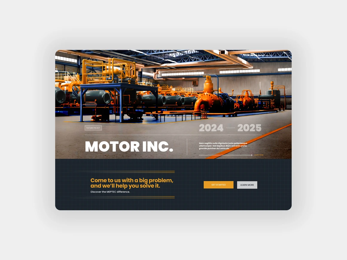
What came out the other side was a clear site map and a set of wireframes, desktop and mobile, that show how every page can tell MEPTEC's story without overwhelming any user or potential client. Navigation and footer now follow the same logic, and every section has a purpose. It's a solid foundation to take into high-fidelity design.